Mallard Speakeasy Cosmopolitan Poster
2026
Statement from the Designer:
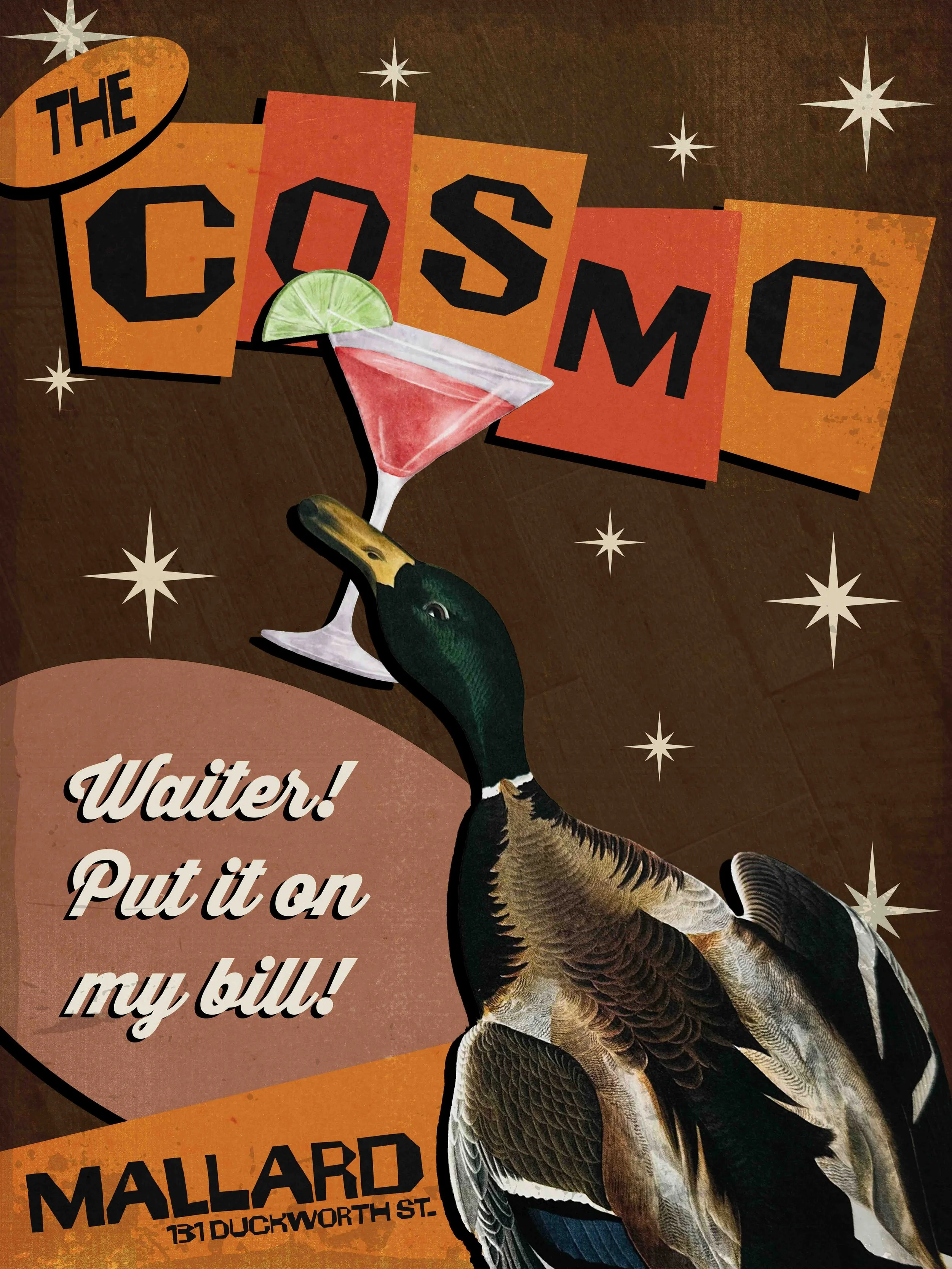
I was prompted to create this poster by a client for their design concept for a speakeasy bar. He relayed to me that this hunting-lodge-turned-bar was very vintage in style. Its style revolved mostly around rustic wooden textures, duck imagery, and strung up incandescent Christmas lights.
My client specified that he was looking for a poster design very reminiscent of 50’s tin posters. He wanted something to hang up in his bar to act as a self-promotional advertisement of their bar’s twist on the classic Cosmopolitan. He also specifically asked for a little one-line joke to be used in the advertisement, to fit his idea of his concept.
For the design, I remained in the client’s specified color palette comprised of rich brown shades and bold orange and red accents. I used these colors in alternation for the headline at the top of the poster to mimic the stylings of vintage 50’s posters. I was able to find imagery that reflected the style, and placed them together in a collage-like style. Lastly, in the background I was able to integrate the bar’s rustic wood texture and even add a nod to the Christmas lights with the star shapes that were common in the vintage 50’s style.
The unorthodox quadrilaterals, the cascading diagonals, and the heading typeface, Kuhlman, also create a sort of wonky feeling. This both mimics the vintage style but also reference’s the bar’s chaotic, almost haphazard, theme.